
Brand identity and web design for a Yellowknife-based reproductive health and fertility support resource.
SOLSTICE FERTILITY DOULA
Client:
Solstice Fertility Doula is dedicated to providing reproductive education and fertility support in the Northwest Territories (NWT). Their holistic approach blends a unique northern perspective with scientifically-backed information, aiming to create an inclusive environment that normalizes conversations around reproductive health and fosters personal advocacy.
Their story:
Brand Identity: We created a visual identity that conveys reproductive health care at-a-glance using a combination of elegant graphics and whimsical icon designs that convey growth, guidance and reproductive health.
Icon Design: We illustrated a custom suite of brand icons and graphics tailored for use on their website and social media graphics templates. These elements enhance visual storytelling, making complex ideas about fertility more accessible and relatable to their audience.
Marketing Templates: We developed a set of branded social media templates that empowers Solstice Fertility Doula to promote their services online with consistent and engaging brand graphics. This toolkit simplifies their marketing efforts and allows them to maintain a strong, recognizable presence in the digital space.
Website Design: We designed and developed a user-friendly website that the Solstice Fertility Doula team can easily manage and maintain over the long term, enhancing their online presence. This approach gives them the autonomy to update content and resources as needed, ensuring that their community has access to the most current information and support.
We helped them with:

LOGO DESIGN
The logo features an elegantly stylized uterus icon, which serves as a direct representation of the reproductive health services offered.
Incorporating lunar phases into the logo design conveys cycles and change, symbolizing the natural rhythms of the menstrual cycle.
Stars and celestial elements were integrated into the brand graphics to evoke a sense of wonder and possibility, acting as symbols of guidance, hope, and aspiration.
The integration of floral graphics symbolizes growth and the nurturing aspect of the services provided.
Brand Notes:
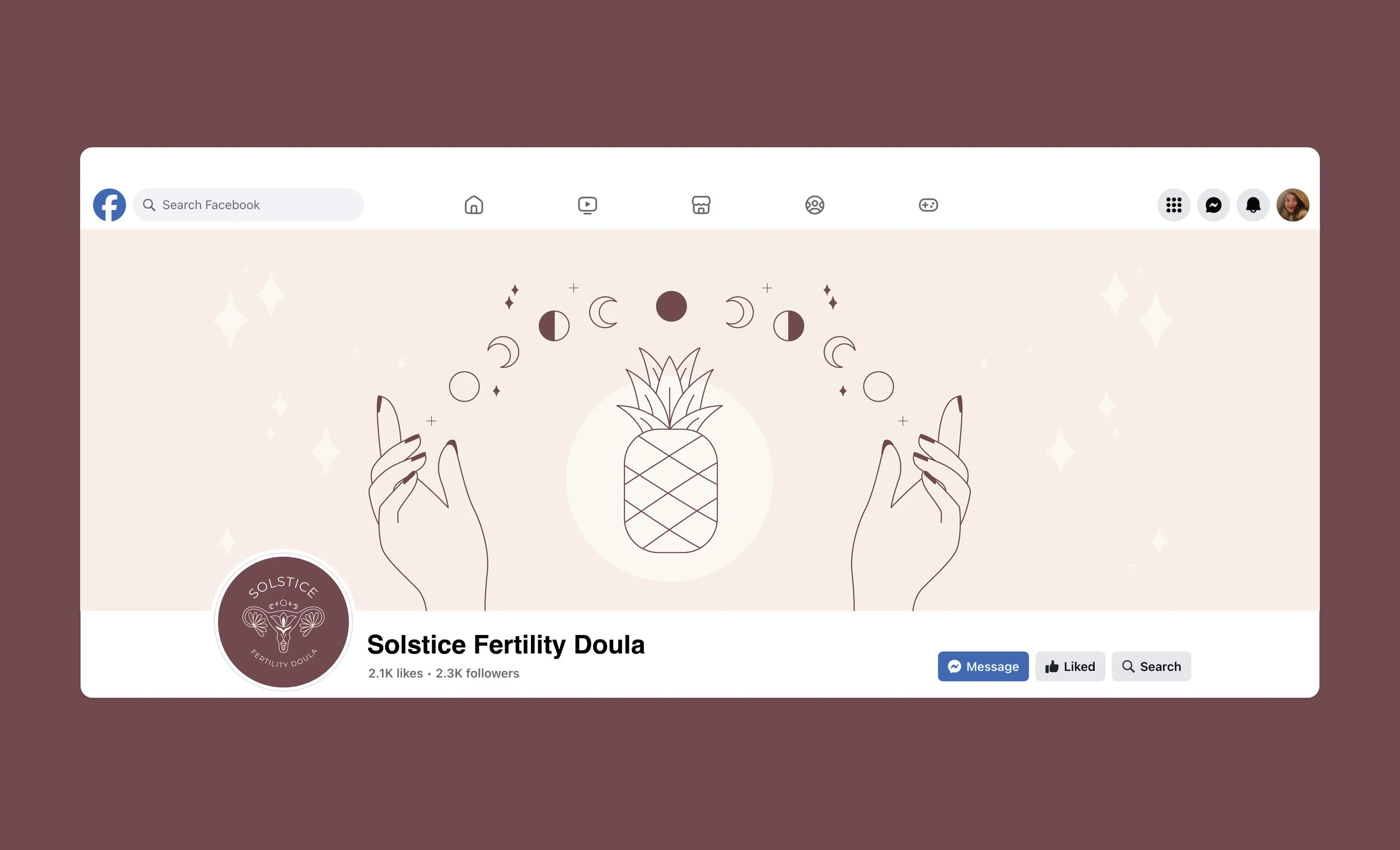
FACEBOOK COVER BANNER
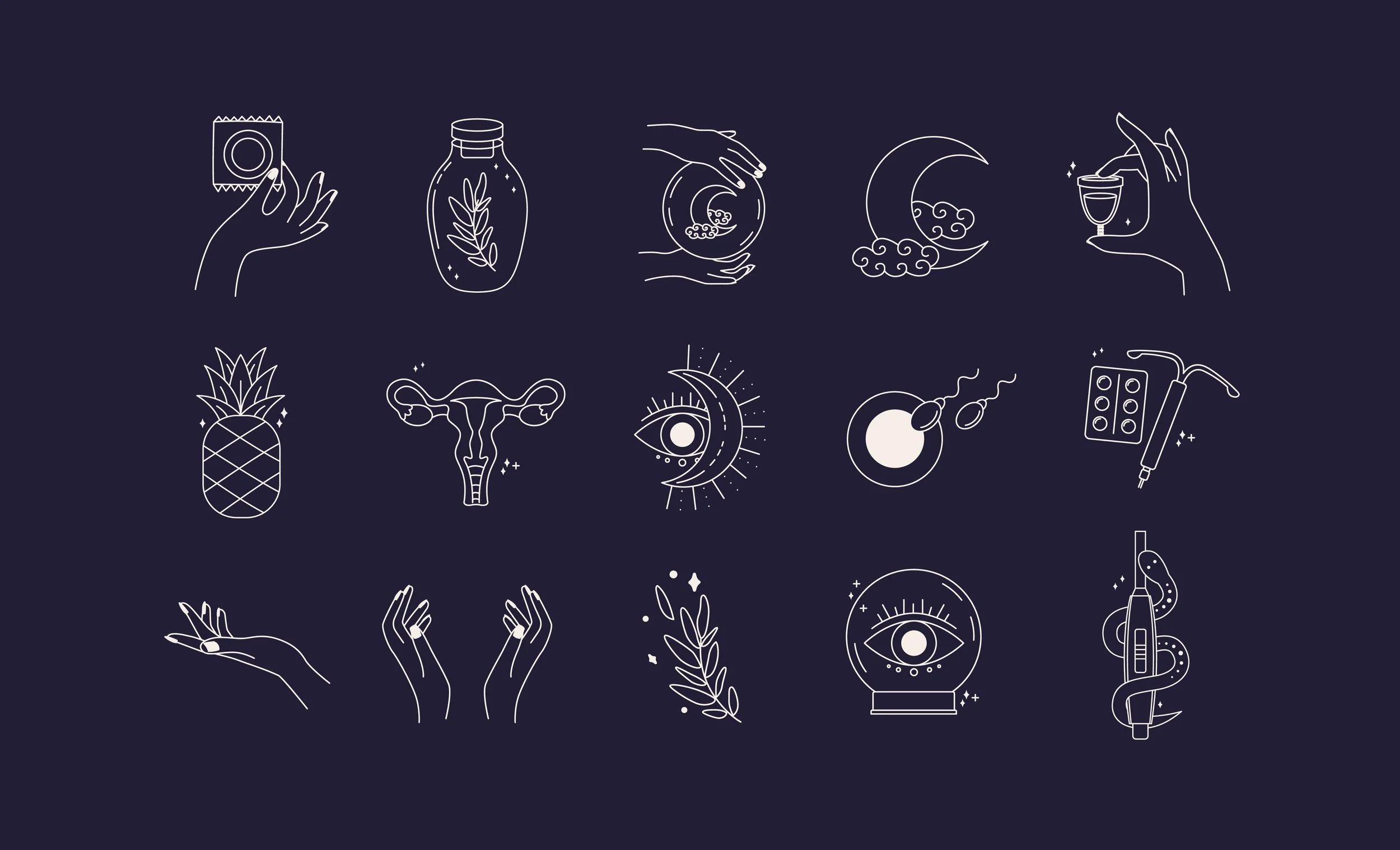
ICON DESIGNS

SOCIAL MEDIA TEMPLATES

SOCIAL MEDIA TEMPLATES

WEB DESIGN